Finding the look
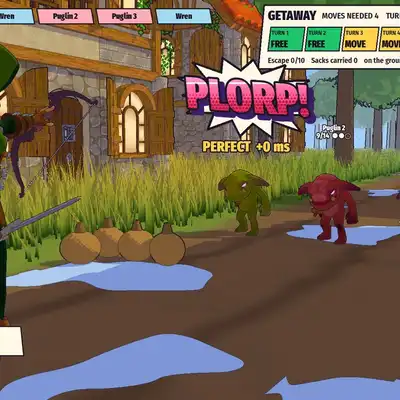
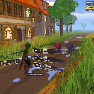
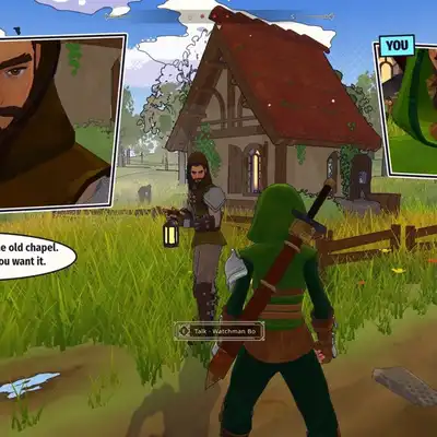
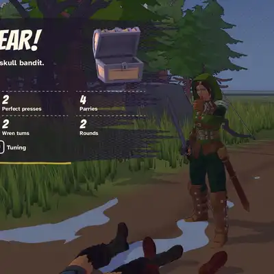
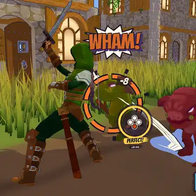
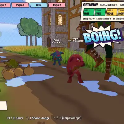
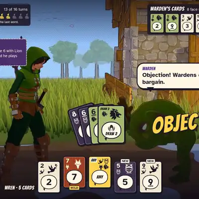
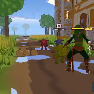
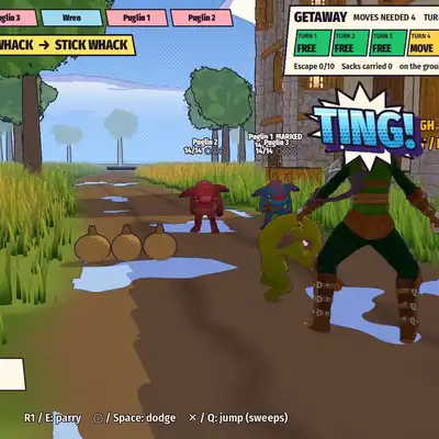
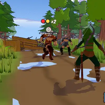
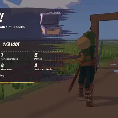
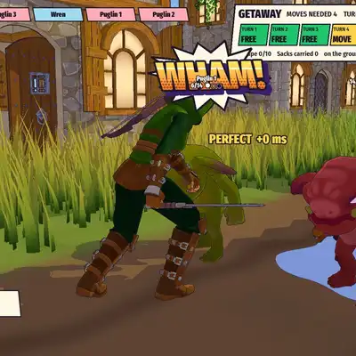
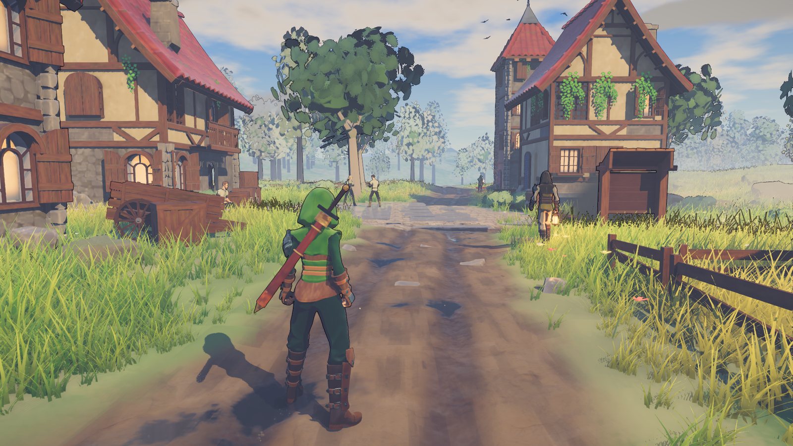
I restyled one village multiple ways to find the game's look.
Human are visual creatures
It is definitely true that one game’s enjoyability doesn’t rely at all on its graphics. Core gameplay loop is one of the most important thing.
Being such a simple creature who like pretty things. I decide the look first before anything. The game is gonna be something that I spend a lot of time to look at at the same time playtest the heck out of it.
So it needs to be easy on the eyes and my preference is always hyper stylized art direction that would feel timeless to experience compared to the hardcore realism look a lot of game go for nowadays.
Multiple round of looks
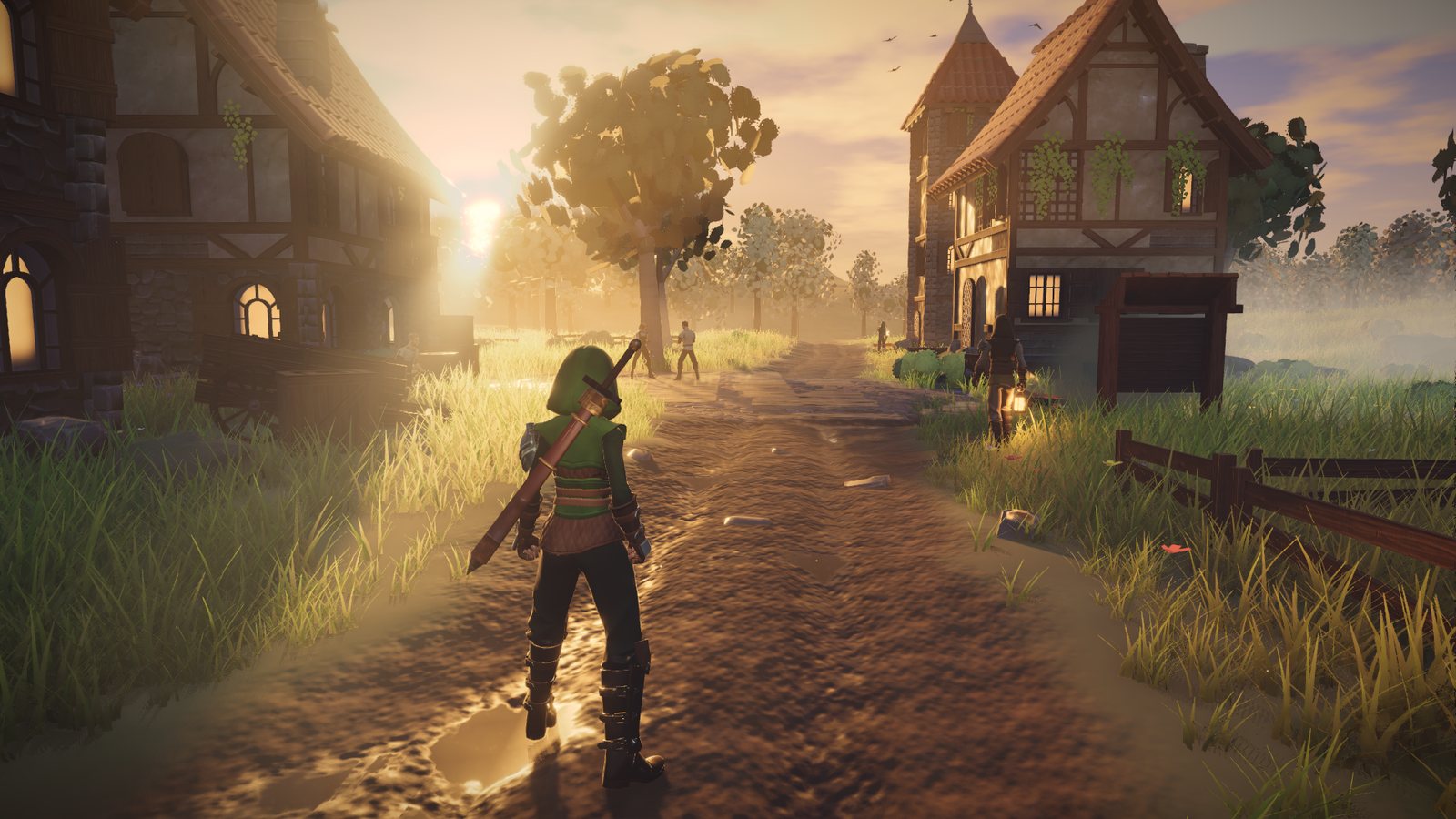
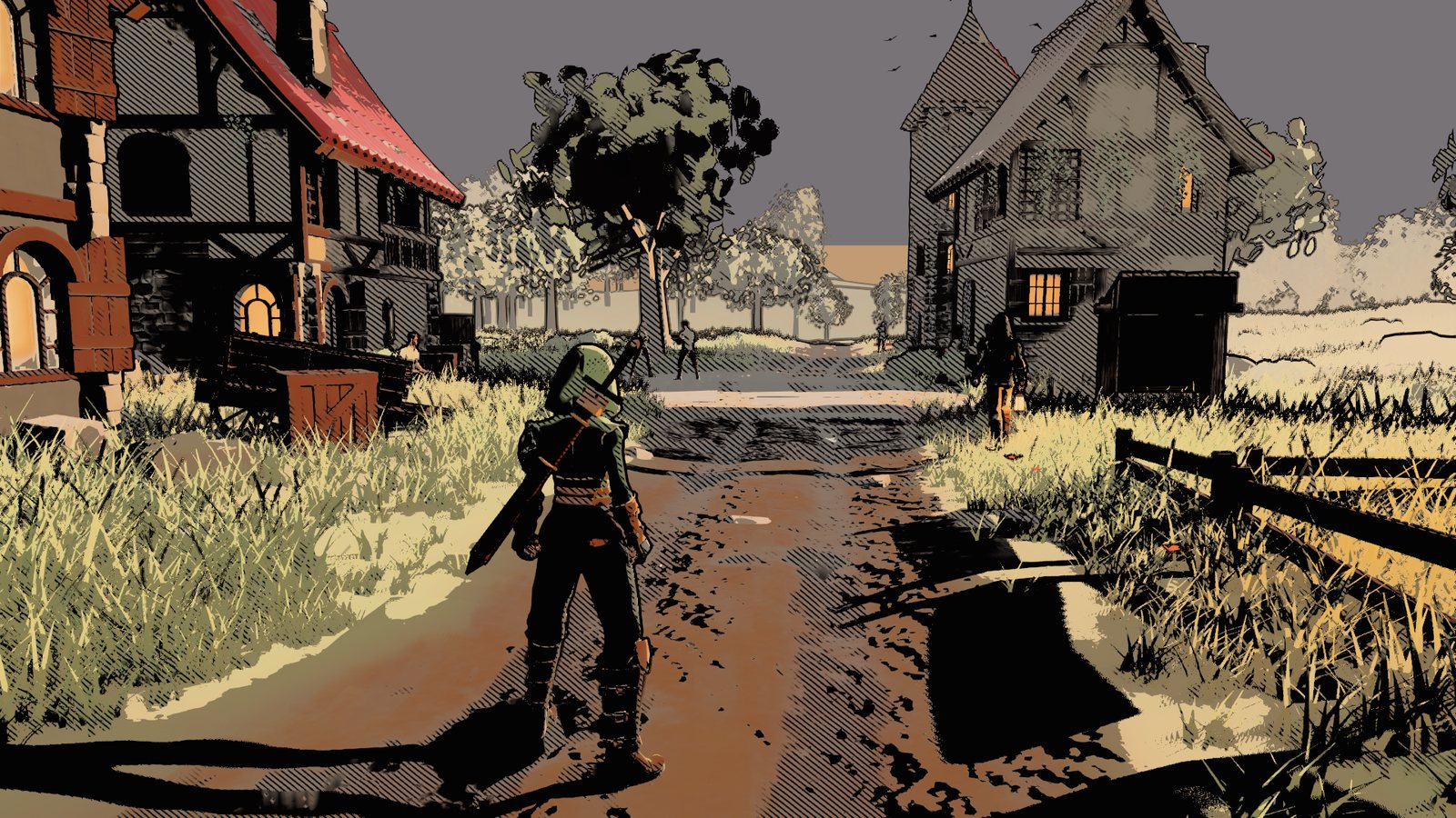
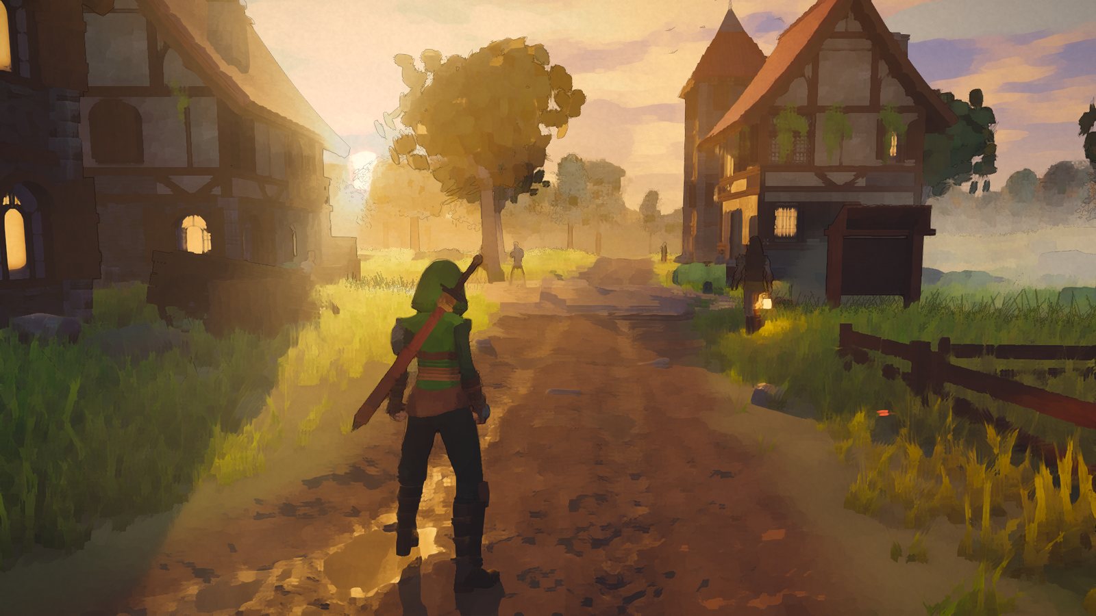
The village road restyled differently each rounds.
Round one was: a BOTW-style cel look, Mignola shadows and a painterly one.
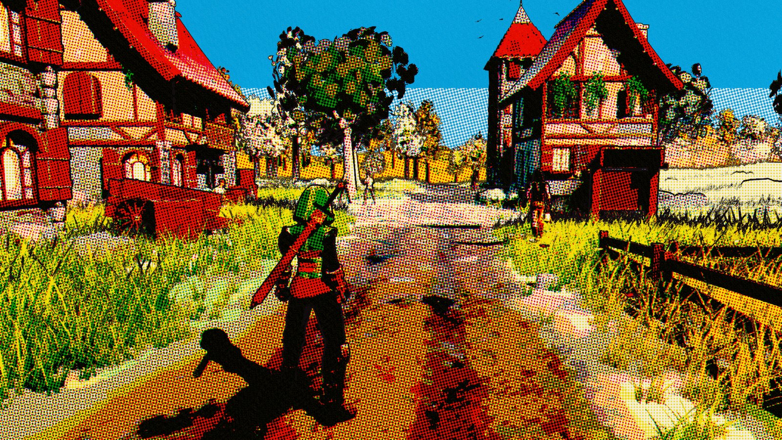
Round two added halftone looks from 1950s Western comics.
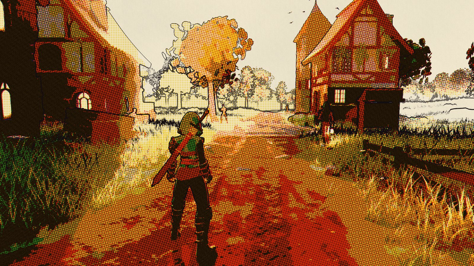
Round three added a Spider-Verse style.
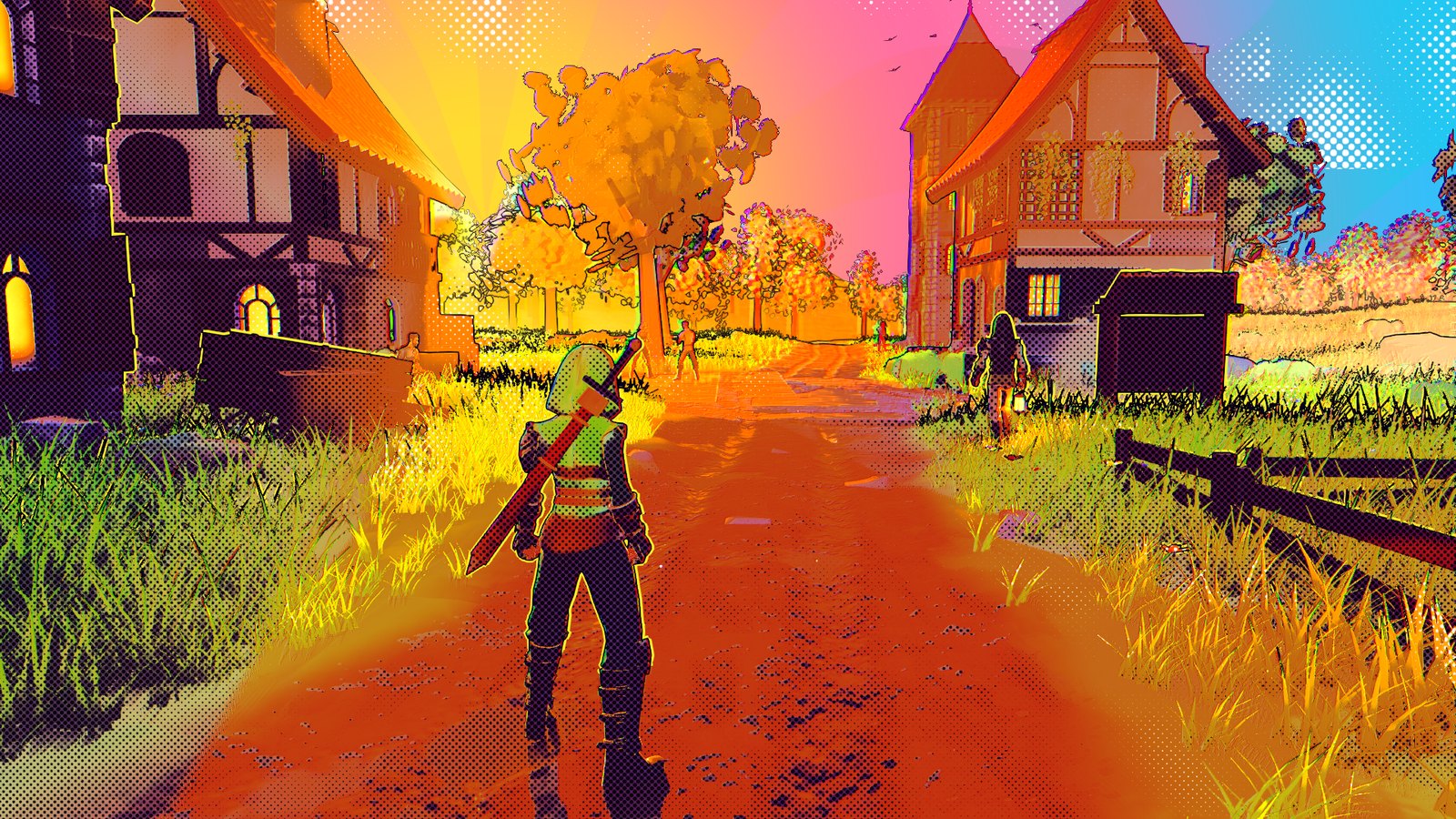
Round four was Ben-Day which steers closer to my liking.
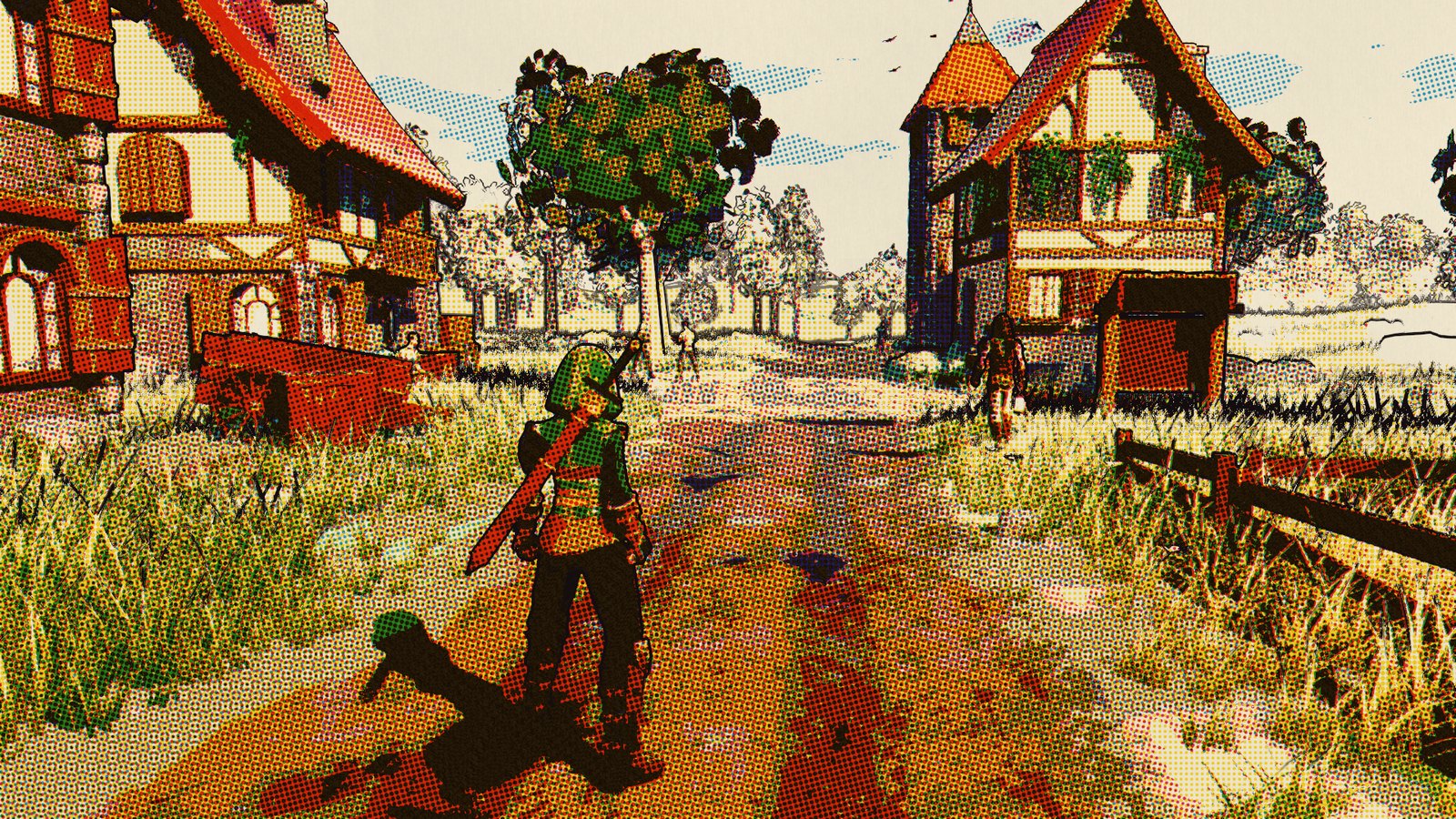
Ben-Day Pop
Back in the day, I remember Pizza Hut would have Spiderman comics with this kind of style. So it kind of nostalgic only I wanted more colors, so I tried Ben-Day with much more pop of vibrancy and almost landed on this one.
Then I played it
And it was too much. The dots were too big, and they were glued to the screen, so every time I turned the camera the dots came along with it. It started to feel like a filter players would switch off even tho the stills look quite good.
Cel Comic
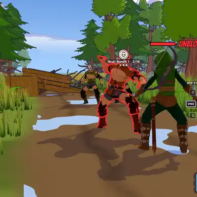
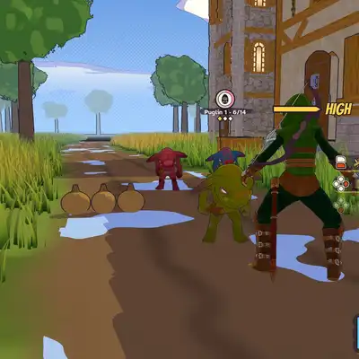
Toning down on previous decisions for the look resulted in simple Cel Comic style. Two flat bands of light and shade, ink lines, a thin outline round the characters, and halftone dots in just three places: the sky at the horizon, the shade bands and the dust from effects. The dots are pinned to the surface now, so they stay put when the camera moves.
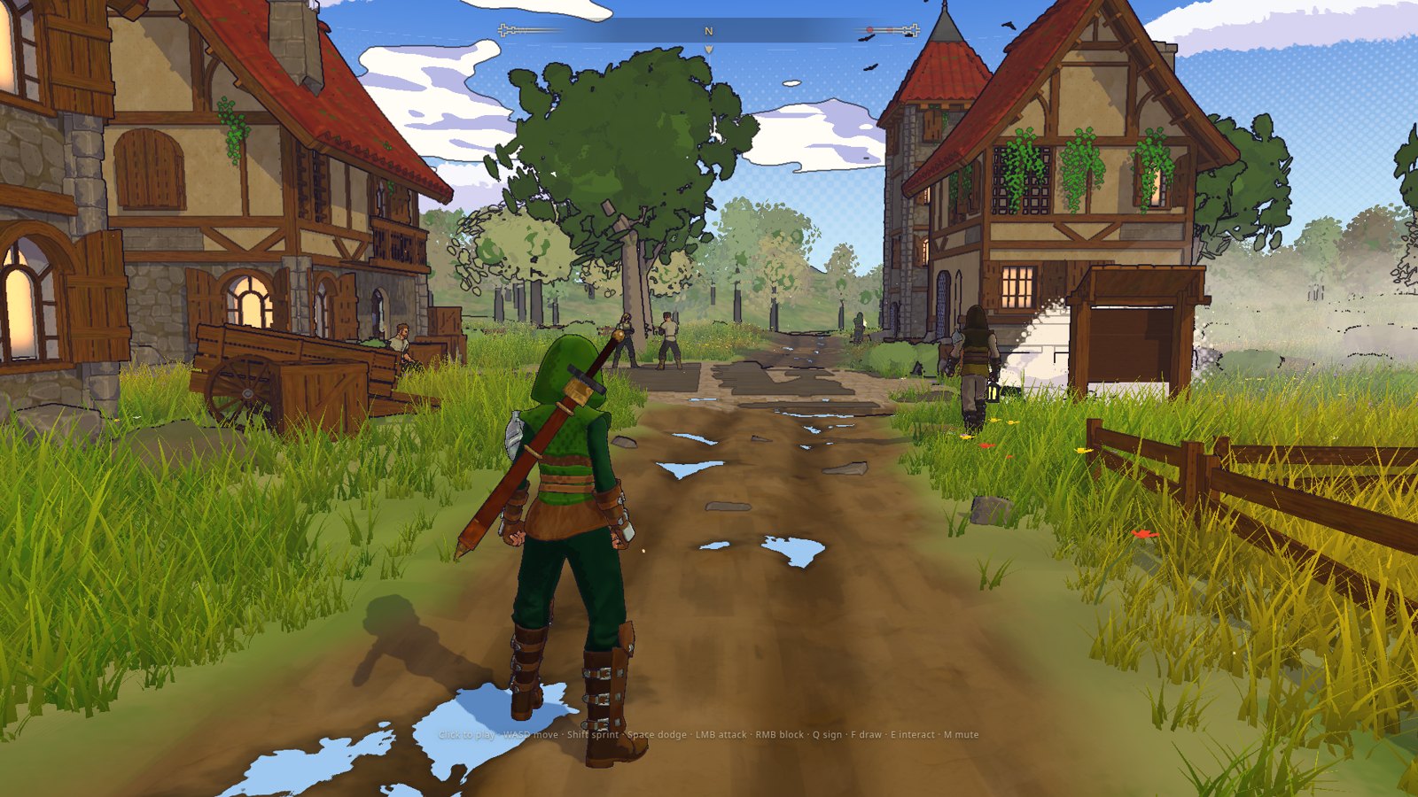
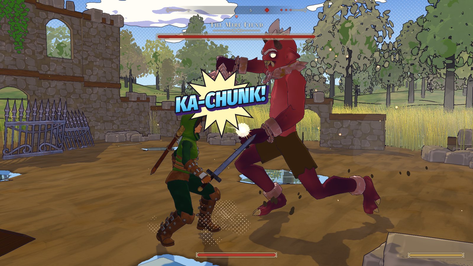
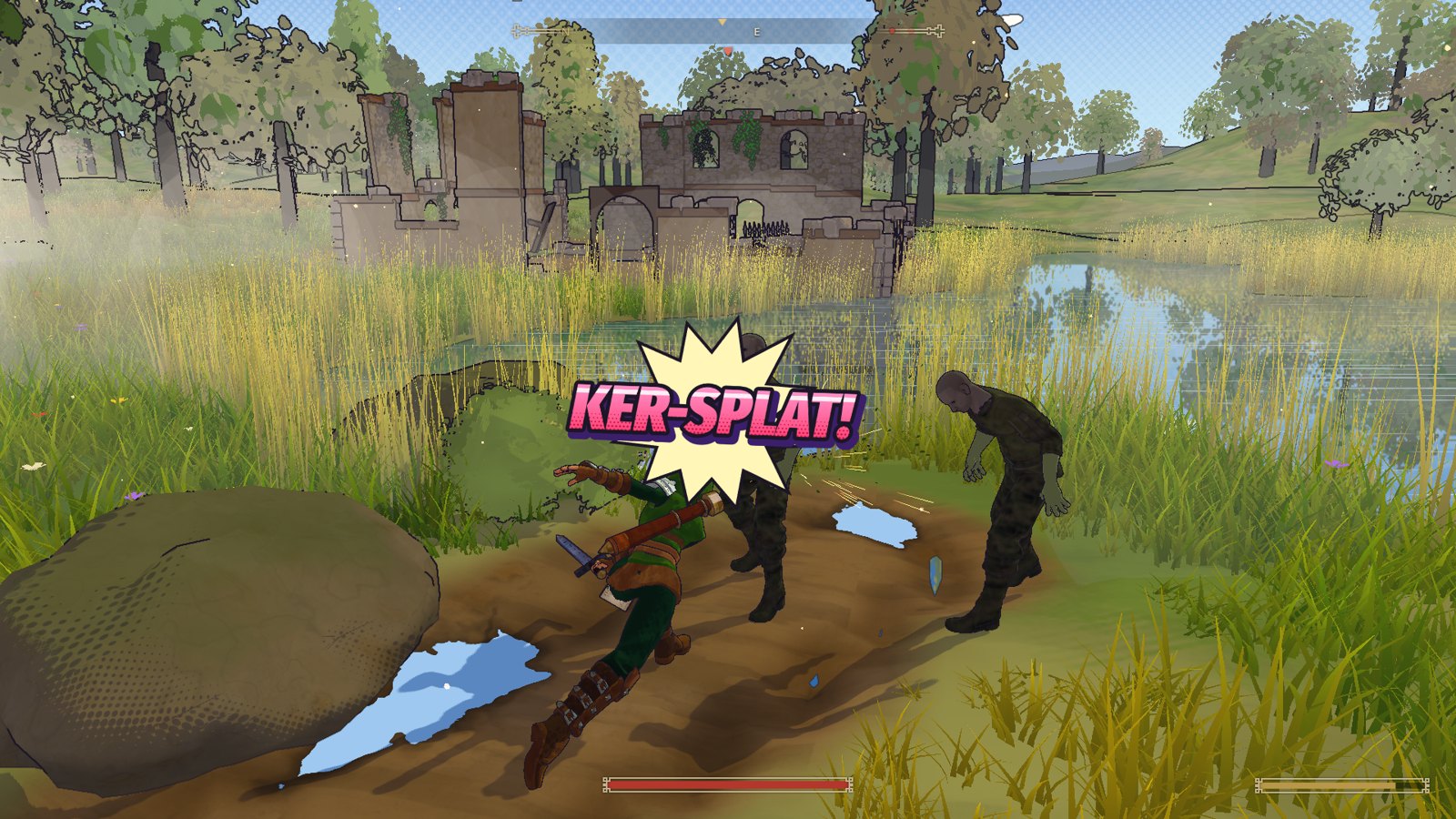
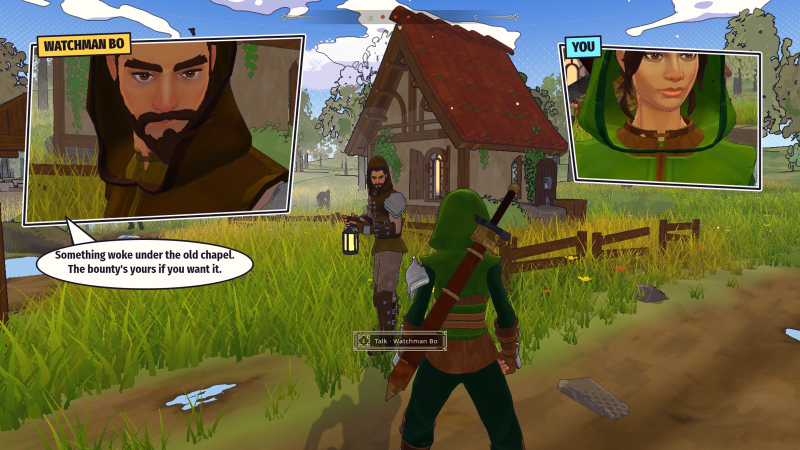
One can argue it look a little bit plain but hey, maybe I can add all those looks and styles then let player decides eh?
For now, I’m sticking with this look, but something else need to change which is the Game Engine.
No comments yet